Showing posts with label Graphic Design. Show all posts

Monday, April 21, 2014

Happy Birthday, Game Boy!

Today marks the 25th anniversary of the venerable Game Boy console. Despite its pokey processor and unbacklit monochrome screen, I'll always remember the time I spent with it fondly. Whether I was climbing a mysterious tower in search of a fabled paradise in Final Fantasy Legend or tossing a pokeball at Mewtwo in Pokémon, the Game Boy always felt like a console that embraced its limitations instead of being bound by them.

So here's to you, Game Boy! I'll play a few 8-bit soundtracks on loop in your honor. I also made this info graphic—my first—to celebrate the occasion. For such an antiquated piece of technology, the Game Boy sure had staying power!


By the way, if anyone's curious what font Nintendo used for the Game Boy logo, it's Gill Sans. I also used a font called Early Gameboy for the pixelly parts.

Monday, August 27, 2012

Somebody Set Up Us the Bomb

MINION MONDAY
 
Of all the games I’ve worked on for Minion Games, The Manhattan Project was by far the largest undertaking. There were plenty of cards, boards, tokens, and funny little men to fashion for sure, but more than that, capturing the zeitgeist of World War II era propaganda and aesthetics was a deeply involving process. Instead of purely abstract spaces, The Manhattan Project is full of papers and posters, cards and envelopes, flyers and ephemera of a bygone day. Not only the design of these had to be right, but I wanted them to look old, like this box was a relic found stowed in the recesses of an attic.

CLICK TO BLOW UP
James Mathe, Minion Games whipcracker and all-around nice guy, was a stalwart ally in this cause. Throughout the process, he was always quick with an old 50s newspaper ad, vintage sales receipt, or a clever idea. Really, I can’t express enough it's worth your time to research materials in the theme you want to recreate! As much as you think you know a given look, there's nothing like a small period detail that can make a design sing.

The game’s main board was the bulk of the work. Since I wanted to convey a messy engineer’s desk, each element had to have its own design. I’m not fond of repurposing other’s stock images, so most everything had to be painted from scratch, from the weathered plastic frame of the cork board to the dingy ash tray that serves as the game’s “Bribe Pile.”

While the idea of a mess of papers was fun, I still wanted each piece to make logical sense. The spy track as film on a top secret file folder, the factories on an inventory receipt, and the university diploma all reinforce the idea of the what a given space you can place your hard-working workers is for.

For the cards, I wanted to reference the propaganda posters that are so defining of the time period. Bold but limited palettes, period fonts, and a good coat of wear and tear fleshed out the look. Instead of the standard white or black border, I placed the key elements on an actual poster shape, complete with tattered edges and a shadow to give that poorly pasted on effect.

FontBook, an iPad app I mentioned in a previous entry, was a great resource for font selection, with its ability to sort typefaces by the year they were created. Exploring these mid century fonts was a real joy.

The original Manhattan Project sold through its print run almost immediately on release, but fret not! Minion Games has launched a new Kickstarter. Not only can you get the original game, but a “Mega Expansion,” containing new bombs, buildings, nations, rockets, and famous people of the era, is up for grabs. You can even get this T-Shirt I designed exclusive to project backers!

Monday, May 14, 2012

A God at Sea

MINION MONDAY
 
It’s time for another Minion Monday, and this time I’m going to show you Minion Games’ latest, Tahiti!

Yeah, yeah. Those of you well-versed in Euro-style board games will have seen countless iterations of the “manage some goods at an oceanic locale that also serves as the game’s name” schtick. But where theme often exists as a last-minute coat of paint, Tahiti fully avails itself of the lore surrounding its namesake island. The Tiki aesthetic throughout the game’s art and design is fun right out of the box, before you so much as place so much as a tile on the table. Little touches, like actually piloting a little canoe from island to island as you pick up and deliver goods, makes the specific Pacific choice of setting much more than an arbitrary skinning of the mechanics.

Minion Games once again teamed up with Chuck Whelon for the artwork. As he had for his work on Nile, Chuck really researched the source material for an authentic experience. Well...authentic to the Tiki aesthetic anyway, which like so many things has been host to a bevy of Western exaggerations and extrapolations. Still, any Tiki-head will be well at home at this gaming archipelago.

As we did for Kingdom of Solomon, Venture Forth, and The Manhattan Project, Minion Games is using crowd funding site Kickstarter to help offset costs and drum up interest in Tahiti. But those games were Kickstarted relatively early in their production cycles, with images and videos revealing great games sporting less-than-great prototype graphics. This time, I convinced James that we might have better success showing off a nearly complete product, one with care taken to present it in the best light. So a lot of my work this time around has been specifically for the Kickstarter effort: Custom text headers, fully-realized prototypes, and of course the box shot gracing the very top of the page.

Has it helped? It’s a bit too early to tell, but so far support has been great! The pledges over the first two days have been the best yet for Minion Games. If you would like to secure your own copy of Tahiti, get in your canoe and go! And if you’re at all like me and love to see unique premiums tied to a project, I designed a bag in conjunction with Dragon Chow only available to higher backers. It’s perfect for pulling out the games’ wooden cubes or nestling whatever you desire in Tiki goodness.

Not sure yet? When you back at the $1 level, you immediately receive a copy of the Print & Play version. If you like what you see, you can upgrade to any of the other great tiers, including a dinner with James Mathe — the perfect opportunity to pick his brain about the board game industry!

If nothing else, drop by for the video. Watching James juggle copies of our last two waves of board games is well worth the minute of your time.


 “If game publishing doesnt work out, at least Ill have a career with Ringling!”

Monday, April 23, 2012

Judging a Book by Its (New) Cover

Those of you who have been waiting for a proper OVA update need wait no more. Here it is, the new cover! (Click to see it in its full-size glory.)


Even though this isn’t final, hopefully you all will find lots to love in the revised cover design. Like the rest of the book, the cover illustration is done by talented Niko Geyer, and you may even notice a new look for Wise Turtle Publishing itself!

The Kickstarter for OVA (previously mentioned here) is slated for late June/July, just in time for the game’s 7th anniversary. I’m still tinkering with the pledge premiums list, so if you have an opinion, be sure to let me hear about it! What sort of things would make you back at a higher level, and what would you pay for it? Gauging consumer interest will be very useful before jumping in the crowd-funding deep-end!

Keep checking by, as I will continue to post OVA updates leading up to the Kickstarter, including a look behind the curtains as I finalize the typesetting of the rules.

Sunday, April 8, 2012

The Box and the Hare


Outside of a fleeting flirtation with popularity in the 1980s, rpgs have always been a niche product, a collection of tomes and boxes more likely to be squirreled away in the recesses of some specialized hobby shop than displayed front-and-center in your favorite department store. Still, you’ll see the bigger rpgs, like Dungeons & Dragons, show up in the big chain booksellers, and such games are never-the-less a prominent part of our cultural identity — even if everyone isn’t aware of exactly how to play one.

But in Japan, things are a little different. rpgs may have seen the same brief rise in visibility as they did in the west, with really awesome-looking versions of D&D, Battletech, and other standbys localized for a curious audience, but nowadays Japanese rpgs are lucky to have a tiny space of three or four books in stores. Polyhedral dice are a chore to get a hold of, and besides the venerable D&D, often eschewed in favor of the stalwart six-sider. Suffice it to say, it’s a niche of a niche, to the point where rpgs have to be referred to as “Table-Talk rpgs” to differentiate them from the grossly more popular video game variety.

That’s what makes a game like Golden Sky Stories all the more remarkable. There’s no thriving “story-gaming” culture there, not a slew of diceless rpgs to draw inspiration from, no new-fangled narrative rpgs to be influenced by. It’s a microcosm of rpgs, one largely still in the same boat as our games were 10 years ago. And you'd think a game developed for a much smaller audience may have hit-and-miss production values, especially when you consider that most Japanese webpages look like Geocities came by for a visit and then never left. That’s not the case. gSS is a lovely book, with big, expressive art that brings a rural Japanese town to life. So I’ve tried to be faithful to the original design of the book as I’ve gone about rebuilding it from scratch. (No source files here, folks!)

But still, there are some things throughout the design that seems a little out of place. For instance, the book is split into four parts, seasons, and each section is introduced by art and one of these symbols. You can see the very thematic, almost sumi-e looking paint job behind the character for Spring, right? Looks great!

However, throughout the book, these stark, austere-looking rounded boxes are used for notes and callouts. In a book otherwise so warm and comfy, it seemed inappropriate to me. So I did something about it! Drawing inspiration from the seasonal characters, all of the boxes, tables, and other details have swapped their old rounded-rectangle tool attire for newer threads with rough edges and a more painted look. I think the end result is much more in character with the book, and I can only hope Ryo Kamiya, the book's author, would approve!

For your reading enjoyment, I’ve included an entire spread from the Powers section. The left-hand page features abilities all henge of a given type possess, while recto features optional ones. It’s a neat system, because in order to gain more powers, you have to take the corresponding weakness! The number in parenthesis indicates the amount of Wonder (a sort of story-telling currency) you spend to use that power.


Why the Rabbit, you ask? Well, it only seemed appropriate for today, right? Hope you all have a great Easter!

Sunday, April 1, 2012

Nyan Cat: Rainbow Race

I’m ecstatic to reveal the box art for Minion Games’ next title. As a subject near and dear to my heart, I’m so excited we were able to procure the license bouncing off the success of the now sold-out Manhattan Project.

Nyan Cat: Rainbow Race is a “real-time” card game for 2-4 players based on the popular internet meme. Instead of taking turns, players can draw, discard, and play cards at any time. The deck consists of 6 colors: red, orange, yellow, green, blue, and purple, which are shuffled and evenly divided among the players to become individual draw decks. When you draw a card, you may either place it in your hand or play it to your play area on the table. Cards played to the table are organized by color, and the goal is to create the biggest stack of a single color. Players may not have multiple stacks of the same color on the table in front of them at any point in the game. When players feels like their stack is big enough, they can take the whole stack and put it in their scoring pile. If a stack of that color already exists in the scoring pile, the new pile must be at least one larger, and the old pile is discarded.

There is also the Nyan Cat card. This special rare card can be played on top of anyone’s color stack, and that stack immediately goes to the Nyan Cat player’s scoring pile. Managing how big to make your color stacks — to maximize score value but hopefully not attract other players' desirous eyes! — is the core of the game.

Once all cards have been played or discarded, scoring is handled in traditional Knizian manner: The player with the most cards in their smallest color stack is the winner!

Once again, I can’t express how enthusiastic I am about this game. I designed it from the ground up with Nyan Cat in mind and to be accessible to younger players. I only hope the gaming public will find I’ve succeeded! Keep checking by in the coming months for updates as Nyan Cat: Rainbow Race goes through production!

Monday, March 26, 2012

Ode to a Grecian Game

MINION MONDAY
 
Greek mythology: A tried and true lore of ancient heroes, incomparable threats, and completely baffling logic that is the mainstay of our educational culture. But even if Zeus was found wanting of aspirin and birthed goddesses from his forehead in the driest way a textbook knew how, there’s still an ancient power to these myths, a strength derived from thousands of storytellers, each imparting a bit of their own life, and a bit of their own imperfections, as the tales found their way to the modern day. This is truer of nothing than the Greek's epic poetry, and no one has captured the rhythm and lifeblood of an ancient people as Robert Fagles.

I still remember his translation of the Iliad, an old hardback tome, perhaps then new, resting on the coffee table. The cover black, the top of the leaves painted red, if not for all those sturdy souls sent to House of Death, then for a really swell looking book. It was my mother’s, and where Mythology 101 might not have had any love for the Greek gods and goddesses of yore, she imparted a fascination with swift-footed Achilles and his unquellable rage, Lord of Men Agamemnon, Hector, Paris, Helen, and all the tragedies of the war on Troy.

Rage— Goddess, sing of the rage of Perseus son Achilles! Lines like this reverberated with me, and it inspired a adoration not just for Greek myth, but of all old epic poetry, from the alliterative Beowolf to the often very redundant Gilgamesh.


But for all its enduring imagery and epic tales, the world of Greek myth feels seldom acknowledged in the world of gaming. Sure, one could dig up that GURPS sourcebook or an aging board game of some nature, but for a mythology ripe with all the tropes we associate with the omnipresent medieval fantasy, it’s a missed opportunity for games both new and familiar.

So when Minion Games head honcho James Mathe first showed me Venture Forth, I was pretty enthusiastic. The bones were there for a game rife with the kind of magic I felt reading the epics, and maybe even such irreverent romps as the 1980s Clash of the Titans. But the prototype itself was bare of theme, a blank slate that could as easily been Tolkien as Homer. Time to crack those knuckles!

As I said, the game symbols used in the prototype given to me were all very generic affairs, with medieval chevron shields and golden trophies. I replaced them with Greek equivalents, sturdy round shields, gleaming gladii, and ancient urns. With proper icons in place, it seemed only fitting to use the most iconic of Greek contributions, the architecture of the period, as my inspiration for the card borders.

After completing the frames, I started to place the work by James Denton into my card sheets. The art was big and bold, maybe even a little over-the-top at times, which felt perfect for the sort of Greek high-adventure we were talking about. But inside my frames they felt encroached upon, constrained. One does not contain such gods of men and creatures of myth! It was then I decided to make the artwork “pop over” the edges. It made the monsters more daunting, the heroes more adventuresome, and all in all just seemed more exciting. Unfortunately, most of the artwork was provided without layers, so this effect took quite a bit of love and care. Zooming in at 600% helps as you're carefully trimming the art away from its original background. The end “coming out at you” result was worth the time. The tiny cards feel that much bigger for it.

For the card backs, I decided to make it stand out from the front art by using traditional “black-figure” imagery from Grecian urns. I drew it myself based on a particular urn featuring god of war Ares and surrounded it with the ornamental details that seemed fitting.

Venture Forth itself is a great game that takes the things you love about an adventure board game, leaves out the trite, trying stuff you don’t, and wraps it in a golden fleece of Euro-gaming standbys that together feels fresh and new. Helping your party of adventurers meet their fated ambitions instead of just killing monsters leads to a very Greek feeling tale, and the amount of depth provided by cultivating paths, hiring new heroes, and overcoming obstacles just makes for a very complete and satisfying package.

If that sounds like the kind of game for you, and you lack the ability to pop it fully-formed from your forehead, make Hermes-like haste to MinionGames.com and score yourself a copy. Ordering directly from us means more of your dollar goes to support the people who made the game possible! That, and you'll get this special Treasure Card, not available anywhere else!

Tuesday, January 24, 2012

A Town Where Things Besides People Live

TURTLE TUESDAY

Some of you may know about a little Japanese Role-Playing Game called Yuuyake Koyake. Or maybe you know it by its English moniker, Golden Sky Stories. If you don’t, somewhere, someone referred to it as the Totoro RPG, and it’s not the worst description. The game is not about adventure in the traditional gaming sense. There’s no dragons to be bested, no empires to overturn. Instead, the game is about the little adventures, the day-to-day trials of regular people doing more or less regular things in a small, rural Japanese town. But you are not one of these people. This is a town where things besides people live. You are a henge, an animal spirit, and at your disposal is a little bit of magic. Not much, but enough to help the people of this town.

After reading that, you may already realize Golden Sky Stories is a different kind of game. There's no dice, no statistics in the traditional sense, and not even a chapter on combat. It truly is “heart-warming role-playing,” a kind of experience where you’re more likely to help a boy overcome his fear of the haunted house at the end of town than stomp goblins.

The setting and focus are not Stories’ only charm. The illustrations throughout are captivating, cute to the point of endangering bicuspids everywhere, and go a long way to setting the mood. Of course, deciphering the moonspeak of the original Japanese book is an endeavor most of us aren’t equipped to do.

Luckily for you and me, Ewen Cluney, along with the other half of Starline Publishing, Mike Stevens, translated this special game and will be bringing it to Western readers soon enough. I’ve had the opportunity to read Ewen’s top-secret (well, okay, not-so-secret) English manuscript for Golden Sky Stories, and it’s a real joy. But that shouldn't be any surprise — This isn’t Ewen’s first rodeo after all. But the text is only a part of the job. Someone has to take this text and give it a home in the pages of a book once again. That someone, as it turns out, is me!

It’s a great privilege to take part in bringing this game to life, and I look forward to sharing with you all my progress. Be sure to check by for further updates, and of course follow Ewen's blog and the Starline Publishing website for all the latest news about Golden Sky Stories.

...Oh? Why is this an entry for Turtle Tuesday? Throughout the book, you’ll meet a cast of lovable characters, including Elder Turtle. Here he is patiently listening to Riko, the tanuki henge, as she frets over some dilemma.

Friday, January 20, 2012

Far-Off Promise


A new year lay ahead, and the promise of a new set of days inspires the best intentions. The world echoes with countless commitments to work harder, be healthier, to care for each other, and to change in ways we hadn’t the year before. The sentiments are as often enough as vague as they are well-intentioned, the sort of positive thinking that we can stretch and contract to the size we can make room for.

But I want to do more than that this year. I want a game plan, as much for myself as for the accountability saying it outright provides. That’s not to say 2011 was empty of accomplishments. After all, I helped 
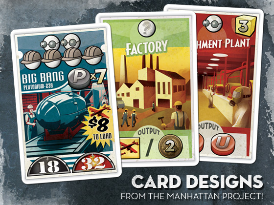
Minion Games ready no less than six games for sale in a single year -- no mean feat! And I took part in a graphical overhaul for DriveThruRPG and its sister sites that will be rolling out soon. Yet, for 2012, I want to get my things done.

So, here it is, my plan for the year. (Split up for your convenience and mine.)

My Blog 
I’ve been moving to a new computer, an iMac, for the past month or two — the lengthy travails of which I'll have to detail one or these days — but I fully intend to get this blog back on track. Besides my usual excursions of fancy, I'm launching several bi-weekly columns.

You’ve seen a taste of the first one with the Digital Gameboard. I’ll be making a point of covering all the gaming apps I come across, especially those involving euro-style board games and their kin. I stand by that the iPad is a great platform for classic board gaming fun and can use all the coverage it can get.

I’ll also be penning my foolhardy quest to play every console rpg ever. It's something that’s become ever more difficult as my list of unplayed and unfinished games grows longer. But maybe by adding you all to my party, this quest may become less of a foolhardy one.

And for those of you wondering, yes Minion Monday will eventually finish out its run. I’m waiting on my own physical copies of the games so I can better show off the components. It’s just taking a little longer than expected.

My Games
While there’s a certain anime-inspired elephant in the room, I have up my sleeves a plethora of games I've tinkered on in perpetuity, and I’d really like to finally get some of them out the metaphorical door and into the light. While finishing, much less releasing, all of them in this revolution of the sun is a unlikely accomplishment, I do want progress, and I want to share that progress with you. Here's a highlight reel of what to expect.

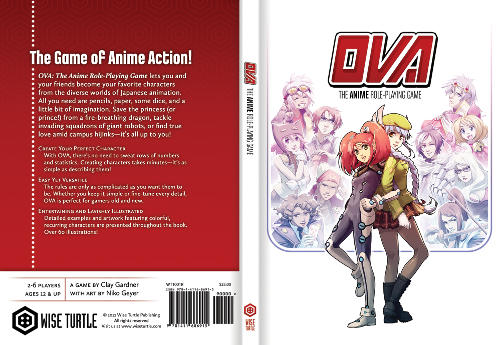
OVA — Yes, the oft-promised return of Wise Turtle's flagship product is still very much in the works, and I’ve made a commitment to its release in the early half of 2012. Long-time fans may have dim memories of several supplements that I hope to talk more about and bring closer to release. You can see a sample of artwork for a sci-fi-themed supplement on the left of the header, done by feguimel.

Legendary! — While I love all my work for Minion Games, and all its games are special to me, they’re still not mine in any true sense of the word. Legendary! is a fantasy dungeon-crawl of a board game inspired by fond childhood memories of Dungeon, but with enough twists to the formula that I believe in its ability to give something new to a crowded and often trite set of games. It’s infused with lore from a lifetime of love for console rpgs, and the very talented Honoel Ibardolaza certainly brings it to life. That trio of numbskulls in the header is his handiwork.

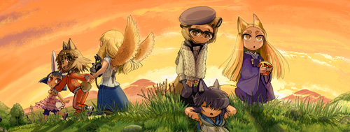
Last Legend — Before OVA, I was a devoted follower (and sometimes contributor) to the Returner Final Fantasy RPG, an attempt to capture the spirit of the eponymous video games in pen and paper form. Eventually I left that community over a difference of opinion...whereas most were concerned with copying the actual game mechanics and number crunching of the video games, I felt the rules would be better served trying to approximate the feel of rpg battles and leave the math for the CPUs that spawned it. Last Legend is my on again, off again take on the subject. You can see some art from it in the header, this time the inks in the background that are once again provided by Honoel.

iOS — Tied in with all these is a general interest in the iOS platform. Now that I have an iMac (more about that in a future post), exploring the world of iPads and iPhones is a real possibility. While the likelihood of me gaining enough prowess with programming to create a game of any decent measure is not good, having access to the tools does open other interesting opportunities. OVA-dedicated apps to aid with dice-rolling, character creation, and even easy rules reference would be a great resource to provide players, and iOS versions of the various Minion Games would be cool indeed.

My work for others
While I said I wanted to make 2012 a year for my projects, there is at least one outside job I'm really excited about. If you follow Ewen Cluney's blog, you may already know what I mean. If not...well, be sure to check by Tuesday for my own official announcement!

Monday, November 14, 2011

Pedal to the Metal

MINION MONDAY

Nitro Dice provided an interesting series of turns for me at Minion Games. It would mark the first time James, resident head-honcho at our little company, delegated the art production outside of our previous Chuck & Clay tag-team. Minion had a ambitious amount of games to publish in 2011, so it was reasonable enough to hire some outside labor to assist driving a few of the graphical vehicles. As it turned out, that didn’t pan out as well as it could have. I ended up having to draw the streets and dastardly hazards — originally the artist’s job — and design the box, tokens, player cards, and card backs — the intended domain of a hired graphic designer. So a decision intended to reduce my workload ended up making me wear twice as many hats...or racing helmets.

Stunts had such realistic graphics!
But that was okay. That’s because there’s something about racing that excites the 10-year-old in me, the kid who’d spend hours playing computer sims like Stunts and Car & Driver, collect hundreds of matchbox cars, and memorize the top speed of the Ferrari Testarossa. (It’s 183 MPH, in case you’re wondering.) Even though the die-cast cars are long put away, and I haven’t bought an honest racing sim since the original Gran Turismo, every blackened skid mark and crack in a curb was rendered with as much love as I could muster.

Even without the theme, Nitro Dice is a pretty unique game. The “Dice” moniker aside, it’s a card game at heart, with the dice themselves only representing your car and its current speed. To navigate the streets without incurring damage, you have to play an identical card from your hand. You can also replace cards on the track with ones containing hazards, dangerous obstacles that can damage and slow down your opponents. Careful placement and hand management are the key to winning!

Once again we went for the double-cut. Since the racing track itself is made from cards, it was imperative to present a cohesive track to race on. Forcing players to speed bump over a black or white border between each card would be a terrible shame, not to mention would rob the dice of space to breathe. I also had to make sure the turns matched seamlessly when you placed cards together.

If you’d like a more in depth overview of the game, try this review. And as always, if you’re interested in purchasing the game, please do some from our store at Minion Games.

Monday, October 31, 2011

A Matter of Grave Importance

MINION MONDAY
Zombies are everywhere. Zombies and horticulture, zombies and islands, zombies and domesticated French canines...

I hate to out myself as part of the infinitesimally small demographic that just doesn’t like them, but — well — I don’t. But I do adore All Hallow's Eve. If you think about it, Halloween is as close to a holiday for gamers and anime fans as there will likely ever be. It’s accepted, nay, encouraged to dress up as your favorite personages from fantasy literature and films, then frolic the evening away. It’s a night of pretend in its purest, unabashed form.

So for all that, I think I can let my distaste for the shambling undead slide this day of the year in the spirit of all things spooky. Besides, this is the perfect Minion Monday to talk to you about Grave Business.

Grave Business is a game of strategic bidding. Send forth your zombies to loot graves for valuables, and while you’re at it, gather new body parts to make more zombies to dig for more treasure. It’s a clever use of theme, with enough thinking to be fun without ever taking itself too seriously.

Chuck Whelon, an artist we've had the pleasure of working with in the past, including Nile and its re-release Nile DeLuxor, colors the game with personality. His work is so big and bold that it really didn’t warrant a lot of graphic-design hoo-hah, but I’m inordinately proud of the game's logo.

If you’d like a more in depth overview of the game, you can check out The Dice Tower's video or take a trip over to Cartrunk for a phantasmally phantastic pheature.

PHOTO COURTESY OF CARTRUNK.NET. SKULL NOT INCLUDED!

Monday, October 24, 2011

Thy Kingdom of Solomon Come

MINION MONDAY
I was going to approach this Minion Monday thing with some semblance of the chronological order the games were made, but after addressing card production with Nile, I think it’s worth staying on topic. Last week I said there were two ways to go about card sheets. With Kingdom of Solomon, though, I developed a third method, one that combines the aesthetics of the double cut with the economy of the solid border.

As you can see, the Kingdom of Solomon Building Cards have art right up to the edge. That normally requires using bleed and the expensive double cut — that is, unless every edge matches seamlessly with its neighbor. As long as that is so, for all intents and purposes it performs the same as a solid border. Shift it up, left, or right, there will never be anything glaringly obvious on the final card. The principle is similar to creating “tiled” backgrounds for webpages and desktop backgrounds. If you ever tried such a feat, you understand it can be a troublesome undertaking. The simplest approach is to make edges mirror images of one another, though quite a bit of tinkering is warranted if you don't want your final cards looking some kind of textural kaleidoscope.

This approach also has another pitfall, and that is you need bleed for it to work.

“Bleed‽” you cry in dismay, having long searched your emotions for a proper use of an interrobang, “But you said you could do this with a single cut!”

This is true. But sadly the sheet of cards you’re creating is not an infinite plane. There will be cards that have no neighbor when you reach the outskirts of the sheet. With the solid border method, this is a simple exercise in using the paintbucket, but here you will have to once again revisit a proper seamless edge. It’s a bit of extra effort, but it can really make a card design shine without breaking the bank.

Kingdom of Solomon itself is not a card game, but a worker-placement game where you manage resources and show up your fellow players in the eyes of King Solomon. The Kickstarter video surmises the gameplay in as good a way as I can imagine. If this sounds up your alley, you can preorder now at Minion Games and get a special bonus Building Card not in store-bought versions. With the game arriving in a matter of weeks, there's no time like the present!

Monday, October 17, 2011

It's Not Just a River In Egypt

MINION MONDAY

For the better part of the last year, I’ve been pouring much of my creative energy into work for Minion Games. Six games later, I’m finally done for the year. While I can't say I’ll exactly miss the overnight deadlines, constant revisions, and counting pixels, I find myself a little lost without the nagging Minion at my side. I’ve been on board with this board game company since its inception in late 2009, and there was always a game to work on, a convention to make. Now that there isn’t, the ability to breathe is welcome but alien, too.

Of course, the upshot of this new free time is I can actually spare a moment to share my toils with you. Welcome to Minion Monday!

Nile was one of our first games — and our earliest success. But our original printer, an outfit from China, provided a product with chitzy cards, fragile boxes, and, in the worst cases, thoroughly damp product. With our 2011 wave of games, we switched to Ludo Fact, a German printer. The price involved was considerably more, but the end result was worth the investment. Nile DeLuxor takes advantage of this better production and includes the all new Monuments expansion and additional crop types to support more players.

Since it’s a re-release of an old game, most of the work was repurposing old art to fit the new bigger box (and boy it’s great to hold!) and expanding the manual with new rules and much-needed graphical examples. But working on it reminded me of an important lesson we learned the first time around.

When cards are produced, they are initially printed out on a huge sheet. This over-sized poster is then cut into the familiar round-cornered rectangles we know and love. By nature of this process, the printed artwork may not perfectly line up with the dies, the metal blades that cut the shapes. The result is the top image on the right. See how the Papyrus’ red is visible on the Wheat card?

There are two ways to get around this. What you’ll see most of the time is a solid-colored border all the way around the card, like in Magic: The Gathering and many other collectable card games. When the graphic gets shifted, it’s not nearly as noticeable.

The option we opted for was the double-cut method. Extra art, or “bleed,” extends from all sides. Instead of a single cut separating cards, an additional cut is made. The excess is discarded, and you have a card that will appear correct no matter which way the art shifts with no visible border. Looks nice, right?

Now here’s where the “lesson” comes in. It costs much, much more to cut cards this way! We did decide to keep the double-cut look for Nile DeLuxor, but it’s an expense any of you aspiring game-makers out there should keep in mind.

As for game itself, I could go into detail about its rules, strategy, and agricultural antics, but the fellow at Drake's Forge does a much more entertaining job of it. He’s right. If Nile is remotely historically accurate, it positively sucks to be a farmer in ancient Egypt.

If you’re interested in purchasing the game, please do so from our website, Minion Games. More of your hard-earned money goes to the hard-working people who make these games!

Friday, March 4, 2011

GM's Day


Today is GM’s Day. I'm always fond of this holiday — for much of the same reasons I'm fond of all things RPG, but the fact I designed the logo doesn’t hurt. It’s among the favorites I've ever done.

It’s also — entirely coincidentally — the third anniversary of Gary Gygax’s passing from this realm. I don’t have as many or as storied memories of his work as some of my role-playing fellows, but I do still remember a certain Dungeon Master’s Guide. Frayed about the edges, its interior cluttered and haphazard for sure, but that book was just filled with so much wonder. Its delightfully diffuse vernacular was both esoteric and amiable in a way that can only be called Gygaxian. I miss books like that.