

Of all the games I’ve worked on for Minion Games, The Manhattan Project was by far the largest undertaking. There were plenty of cards, boards, tokens, and funny little men to fashion for sure, but more than that, capturing the zeitgeist of World War II era propaganda and aesthetics was a deeply involving process. Instead of purely abstract spaces, The Manhattan Project is full of papers and posters, cards and envelopes, flyers and ephemera of a bygone day. Not only the design of these had to be right, but I wanted them to look old, like this box was a relic found stowed in the recesses of an attic.
 |
| CLICK TO BLOW UP |
The game’s main board was the bulk of the work. Since I wanted to convey a messy engineer’s desk, each element had to have its own design. I’m not fond of repurposing other’s stock images, so most everything had to be painted from scratch, from the weathered plastic frame of the cork board to the dingy ash tray that serves as the game’s “Bribe Pile.”
While the idea of a mess of papers was fun, I still wanted each piece to make logical sense. The spy track as film on a top secret file folder, the factories on an inventory receipt, and the university diploma all reinforce the idea of the what a given space you can place your hard-working workers is for.
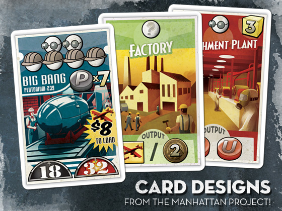 For the cards, I wanted to reference the propaganda posters that are so defining of the time period. Bold but limited palettes, period fonts, and a good coat of wear and tear fleshed out the look. Instead of the standard white or black border, I placed the key elements on an actual poster shape, complete with tattered edges and a shadow to give that poorly pasted on effect.
FontBook, an iPad app I mentioned in a previous entry, was a great resource for font selection, with its ability to sort typefaces by the year they were created. Exploring these mid century fonts was a real joy.
The original Manhattan Project sold through its print run almost immediately on release, but fret not! Minion Games has launched a new Kickstarter. Not only can you get the original game, but a “Mega Expansion,” containing new bombs, buildings, nations, rockets, and famous people of the era, is up for grabs. You can even get this T-Shirt I designed exclusive to project backers!


