I want to thank all of you who supported a little anime-inspired game I made 8 years ago. I hope you find the new version was worth the wait!
Wednesday, May 8, 2013
OVA: The Anime Role-Playing Game Kickstarter is Live!
The day is finally here! After much tireless effort, OVA: The Anime Role-Playing Game's Kickstarter is live! You can check on its progress to the right, or click the link below to find out more.
I want to thank all of you who supported a little anime-inspired game I made 8 years ago. I hope you find the new version was worth the wait!
Monday, August 27, 2012
Somebody Set Up Us the Bomb
MINION MONDAY
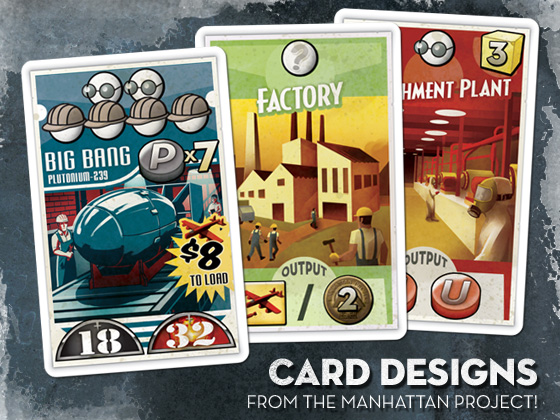
Of all the games I’ve worked on for Minion Games, The Manhattan Project was by far the largest undertaking. There were plenty of cards, boards, tokens, and funny little men to fashion for sure, but more than that, capturing the zeitgeist of World War II era propaganda and aesthetics was a deeply involving process. Instead of purely abstract spaces, The Manhattan Project is full of papers and posters, cards and envelopes, flyers and ephemera of a bygone day. Not only the design of these had to be right, but I wanted them to look old, like this box was a relic found stowed in the recesses of an attic.
James Mathe, Minion Games whipcracker and all-around nice guy, was a stalwart ally in this cause. Throughout the process, he was always quick with an old 50s newspaper ad, vintage sales receipt, or a clever idea. Really, I can’t express enough it's worth your time to research materials in the theme you want to recreate! As much as you think you know a given look, there's nothing like a small period detail that can make a design sing.
While the idea of a mess of papers was fun, I still wanted each piece to make logical sense. The spy track as film on a top secret file folder, the factories on an inventory receipt, and the university diploma all reinforce the idea of the what a given space you can place your hard-working workers is for.
For the cards, I wanted to reference the propaganda posters that are so defining of the time period. Bold but limited palettes, period fonts, and a good coat of wear and tear fleshed out the look. Instead of the standard white or black border, I placed the key elements on an actual poster shape, complete with tattered edges and a shadow to give that poorly pasted on effect.

FontBook, an iPad app I mentioned in a previous entry, was a great resource for font selection, with its ability to sort typefaces by the year they were created. Exploring these mid century fonts was a real joy.
The original Manhattan Project sold through its print run almost immediately on release, but fret not! Minion Games has launched a new Kickstarter. Not only can you get the original game, but a “Mega Expansion,” containing new bombs, buildings, nations, rockets, and famous people of the era, is up for grabs. You can even get this T-Shirt I designed exclusive to project backers!
Of all the games I’ve worked on for Minion Games, The Manhattan Project was by far the largest undertaking. There were plenty of cards, boards, tokens, and funny little men to fashion for sure, but more than that, capturing the zeitgeist of World War II era propaganda and aesthetics was a deeply involving process. Instead of purely abstract spaces, The Manhattan Project is full of papers and posters, cards and envelopes, flyers and ephemera of a bygone day. Not only the design of these had to be right, but I wanted them to look old, like this box was a relic found stowed in the recesses of an attic.
| CLICK TO BLOW UP |
The game’s main board was the bulk of the work. Since I wanted to convey a messy engineer’s desk, each element had to have its own design. I’m not fond of repurposing other’s stock images, so most everything had to be painted from scratch, from the weathered plastic frame of the cork board to the dingy ash tray that serves as the game’s “Bribe Pile.”
While the idea of a mess of papers was fun, I still wanted each piece to make logical sense. The spy track as film on a top secret file folder, the factories on an inventory receipt, and the university diploma all reinforce the idea of the what a given space you can place your hard-working workers is for.
FontBook, an iPad app I mentioned in a previous entry, was a great resource for font selection, with its ability to sort typefaces by the year they were created. Exploring these mid century fonts was a real joy.
The original Manhattan Project sold through its print run almost immediately on release, but fret not! Minion Games has launched a new Kickstarter. Not only can you get the original game, but a “Mega Expansion,” containing new bombs, buildings, nations, rockets, and famous people of the era, is up for grabs. You can even get this T-Shirt I designed exclusive to project backers!
Monday, July 30, 2012
Just in Case...
It’s no secret I’m really fond of Apple’s various iOS devices. Ever since I got the original iPod touch, it’s become an integral part of the way I work, consume, and interact with the bits and bytes I love.
Something I’m less fond of is Apple’s penchant for cladding its iPods in a stainless steel back. Oh, it’s beautiful for sure, but it’s a malicious and ephemeral sort of beauty, the kind of mirror finish that attracts scratches if you so much as look at it the wrong way. It’s a lesson I learned quickly with that first iPod touch, and one I rectified out-of-the-box when I replaced it with the fourth-generation model some years later. I chose the case from SwitchEasy because it advertised itself as the thinnest case on the market. Having been used to using my previous one naked for all these years, I really wanted the case to be as unobtrusive as possible.
It certainly was thin, and unobtrusive, but it was also a fragile thing, and after a year of use it began to fracture in the corners. I guess there’s a reason other cases weren’t this thin.
So long story short, I needed a new case, pronto. But I wanted it to last, so my preference for a barely-there case was no longer a top requirement. And if I’m wanting it to last...well! I better make it something I want to look at, right?
So that’s how this came to be:
Uncommon prints custom made-to-order cases based on whatever art you send them (like this great combined effort with Niko Geyer). The price may be a bit on the high side, but they take great strides to treat your order as a premium product. The case ships in a nice resealable bag, along with an Uncommon sticker and two $5 discount cards for future orders.
The case itself is definitely tough. It's a solid piece of plastic that won't flex under pressure and just feels solid in the hands. Maybe a little too solid. A thin case it’s not, and it takes the iPod touch’s almost impossible thinness and converts it to a heft more akin to the iPhone line of products. But we saw what thin got me, so I'll give it a pass in this regard.
This is the "capsule" case with a design that separates into two parts. This is ostensibly for easy docking in any matter of peripherals you might own that don't support the case, but doing so casually isn't really possible. Rubber-like strips on the inside of the case hold it firmly in place, making removing either portion a bit of a work out. At least you don’t have to worry about your case coming off accidentally!
Most importantly though the art looks great, with a few caveats. Lines aren't as sharp as they could be, with a ever-so-slight fuzziness to everything. This is almost certainly due to Uncommon’s much-advertised 3D-Tatt® technology. So while you may sacrifice a bit of clarity, the art is embedded deep into the plastic, making it impervious to flaking, surface scrapes, or other things you might normally expect from a printed surface. The art is there for the duration!
The colors are also off a bit, in general having a more yellow cast. Karis's hair also came out an almost bubblegum pink shade. But the colors are close enough that you probably won’t notice without a direct comparison.
That nitpicking aside, I’m really pleased with it. Having a customized case makes it really feel like your own, and I’m infinitely happier with it than a generic solid or pre-printed pattern.
An interesting aside is that the case is completely odorless. Most people probably don’t get what I’m saying here, but for those of you that are starkly aware of every new piece of electronics they buy, the Uncommon case is a pleasant surprise. I really expected a real painty-smell from the custom ink process, but really, there’s nothing. Even the flimsy SwitchEasy case (which was clear) had a stark plastic scent that lasted for a month — even transfers to your hands. It’s a small note, but a real exception to the rule in products like this.
As a final footnote, Uncommon's customer service is great. I was always able to get a live person on the phone, and they adeptly answered questions I had about bleed and such without having to play telephone relay with me. And when my first case shipped with the art between the halves not aligned, it only took a quick email to rectify the issue. I received a nigh-immediate response assuring me this was a rare error and a new one was shipped to me immediately. No returns. No additional shipping costs. Just a very pleasant experience.
I'd recommend Uncommon if you have an iOS device you want covered. In fact, remember those $5 discount cards I mentioned? I’m willing to give one away! Just leave a reply with the kind of case you want to make, and I'll send one lucky person the code. Feel free to pass along this post to anyone you think might be interested!
Tuesday, June 12, 2012
Get your Kicks on Route 6d6
Hey, everybody. If you can’t tell by the title graphic above, here’s another update on OVA’s eventual Kickstarter.
If you follow the forums on RPG.net, you may have come across a thread where I have been discussing the final pledge tiers. For those of you who don’t — or simply missed the exchange — I’m including it here:
$15. A copy of the PDF, as well as an advance look at the game before its public release.
$30. The above, and a copy of the full-color printed book.
$50. The above, and your name printed as a patron in the book. You will also have access to a special playtest forum with the opportunity to have your voice heard and help shape the final product.
$75. The above, except your full-color book is upgraded to one of one-hundred limited box sets, each numbered and including: A copy of the printed book, your name listed as a patron, Quick-Start Player Books, a pack of character sheets, a set of trading cards, and a set of dice.
$100 The above, and a special hand-crafted OVA Dice Bag by Dragon Chow Dice Bags.
$250 The above, and a custom character sheet featuring an illustration of your character by the official OVA artist.
Since that thread, I’ve been researching the cost of the various pledge premiums, and I've found it’s very difficult to get a box produced in any quantity less than 500, and even then it’s almost as cost-effective to get 1000. I have found an option at Superior PoD with very reasonable rates for small numbers, but the box itself looks a little flimsy. Here, take a look.
The print quality looks great, and the build seems well put together with sharp corners. It’s something I wouldn’t bat an eye at if it were simply a container to hold a bunch of goodies. But my goal was to evoke the RPGs of yesteryear, and this isn't the thick cardboard heavy-duty box you may be used to. It's more like the boxes they use for "Collector's Edition" video games.
So what do you guys think? Would you still consider a box like this a decent collectable for high-pledge tiers? Or should I revise my pledge tiers and try something else entirely?
Monday, May 14, 2012
A God at Sea
MINION MONDAY
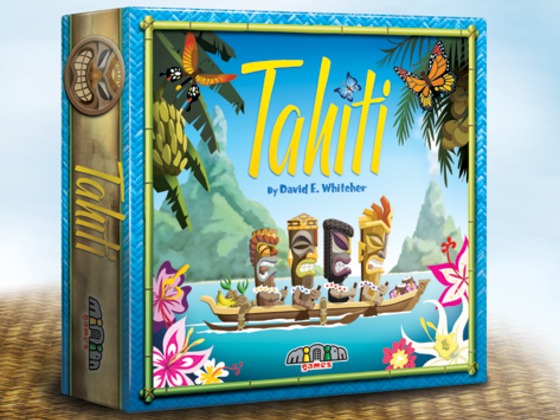
It’s time for another Minion Monday, and this time I’m going to show you Minion Games’ latest, Tahiti!
Yeah, yeah. Those of you well-versed in Euro-style board games will have seen countless iterations of the “manage some goods at an oceanic locale that also serves as the game’s name” schtick. But where theme often exists as a last-minute coat of paint, Tahiti fully avails itself of the lore surrounding its namesake island. The Tiki aesthetic throughout the game’s art and design is fun right out of the box, before you so much as place so much as a tile on the table. Little touches, like actually piloting a little canoe from island to island as you pick up and deliver goods, makes the specific Pacific choice of setting much more than an arbitrary skinning of the mechanics.
Minion Games once again teamed up with Chuck Whelon for the artwork. As he had for his work on Nile, Chuck really researched the source material for an authentic experience. Well...authentic to the Tiki aesthetic anyway, which like so many things has been host to a bevy of Western exaggerations and extrapolations. Still, any Tiki-head will be well at home at this gaming archipelago.
As we did for Kingdom of Solomon, Venture Forth, and The Manhattan Project, Minion Games is using crowd funding site Kickstarter to help offset costs and drum up interest in Tahiti. But those games were Kickstarted relatively early in their production cycles, with images and videos revealing great games sporting less-than-great prototype graphics. This time, I convinced James that we might have better success showing off a nearly complete product, one with care taken to present it in the best light. So a lot of my work this time around has been specifically for the Kickstarter effort: Custom text headers, fully-realized prototypes, and of course the box shot gracing the very top of the page.
Has it helped? It’s a bit too early to tell, but so far support has been great! The pledges over the first two days have been the best yet for Minion Games. If you would like to secure your own copy of Tahiti, get in your canoe and go! And if you’re at all like me and love to see unique premiums tied to a project, I designed a bag in conjunction with Dragon Chow only available to higher backers. It’s perfect for pulling out the games’ wooden cubes or nestling whatever you desire in Tiki goodness.
Not sure yet? When you back at the $1 level, you immediately receive a copy of the Print & Play version. If you like what you see, you can upgrade to any of the other great tiers, including a dinner with James Mathe — the perfect opportunity to pick his brain about the board game industry!
If nothing else, drop by for the video. Watching James juggle copies of our last two waves of board games is well worth the minute of your time.
It’s time for another Minion Monday, and this time I’m going to show you Minion Games’ latest, Tahiti!
Yeah, yeah. Those of you well-versed in Euro-style board games will have seen countless iterations of the “manage some goods at an oceanic locale that also serves as the game’s name” schtick. But where theme often exists as a last-minute coat of paint, Tahiti fully avails itself of the lore surrounding its namesake island. The Tiki aesthetic throughout the game’s art and design is fun right out of the box, before you so much as place so much as a tile on the table. Little touches, like actually piloting a little canoe from island to island as you pick up and deliver goods, makes the specific Pacific choice of setting much more than an arbitrary skinning of the mechanics.
As we did for Kingdom of Solomon, Venture Forth, and The Manhattan Project, Minion Games is using crowd funding site Kickstarter to help offset costs and drum up interest in Tahiti. But those games were Kickstarted relatively early in their production cycles, with images and videos revealing great games sporting less-than-great prototype graphics. This time, I convinced James that we might have better success showing off a nearly complete product, one with care taken to present it in the best light. So a lot of my work this time around has been specifically for the Kickstarter effort: Custom text headers, fully-realized prototypes, and of course the box shot gracing the very top of the page.
Has it helped? It’s a bit too early to tell, but so far support has been great! The pledges over the first two days have been the best yet for Minion Games. If you would like to secure your own copy of Tahiti, get in your canoe and go! And if you’re at all like me and love to see unique premiums tied to a project, I designed a bag in conjunction with Dragon Chow only available to higher backers. It’s perfect for pulling out the games’ wooden cubes or nestling whatever you desire in Tiki goodness.
Not sure yet? When you back at the $1 level, you immediately receive a copy of the Print & Play version. If you like what you see, you can upgrade to any of the other great tiers, including a dinner with James Mathe — the perfect opportunity to pick his brain about the board game industry!
If nothing else, drop by for the video. Watching James juggle copies of our last two waves of board games is well worth the minute of your time.
“If game publishing doesn’t work out, at least I’ll have a career with Ringling!”
Monday, April 23, 2012
Judging a Book by Its (New) Cover
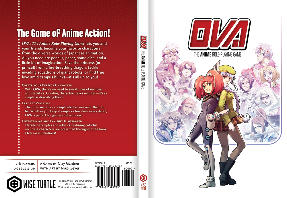
Those of you who have been waiting for a proper OVA update need wait no more. Here it is, the new cover! (Click to see it in its full-size glory.)
Even though this isn’t final, hopefully you all will find lots to love in the revised cover design. Like the rest of the book, the cover illustration is done by talented Niko Geyer, and you may even notice a new look for Wise Turtle Publishing itself!
The Kickstarter for OVA (previously mentioned here) is slated for late June/July, just in time for the game’s 7th anniversary. I’m still tinkering with the pledge premiums list, so if you have an opinion, be sure to let me hear about it! What sort of things would make you back at a higher level, and what would you pay for it? Gauging consumer interest will be very useful before jumping in the crowd-funding deep-end!
Keep checking by, as I will continue to post OVA updates leading up to the Kickstarter, including a look behind the curtains as I finalize the typesetting of the rules.
Even though this isn’t final, hopefully you all will find lots to love in the revised cover design. Like the rest of the book, the cover illustration is done by talented Niko Geyer, and you may even notice a new look for Wise Turtle Publishing itself!
The Kickstarter for OVA (previously mentioned here) is slated for late June/July, just in time for the game’s 7th anniversary. I’m still tinkering with the pledge premiums list, so if you have an opinion, be sure to let me hear about it! What sort of things would make you back at a higher level, and what would you pay for it? Gauging consumer interest will be very useful before jumping in the crowd-funding deep-end!
Keep checking by, as I will continue to post OVA updates leading up to the Kickstarter, including a look behind the curtains as I finalize the typesetting of the rules.
Sunday, April 8, 2012
The Box and the Hare
Outside of a fleeting flirtation with popularity in the 1980s, rpgs have always been a niche product, a collection of tomes and boxes more likely to be squirreled away in the recesses of some specialized hobby shop than displayed front-and-center in your favorite department store. Still, you’ll see the bigger rpgs, like Dungeons & Dragons, show up in the big chain booksellers, and such games are never-the-less a prominent part of our cultural identity — even if everyone isn’t aware of exactly how to play one.
But in Japan, things are a little different. rpgs may have seen the same brief rise in visibility as they did in the west, with really awesome-looking versions of D&D, Battletech, and other standbys localized for a curious audience, but nowadays Japanese rpgs are lucky to have a tiny space of three or four books in stores. Polyhedral dice are a chore to get a hold of, and besides the venerable D&D, often eschewed in favor of the stalwart six-sider. Suffice it to say, it’s a niche of a niche, to the point where rpgs have to be referred to as “Table-Talk rpgs” to differentiate them from the grossly more popular video game variety.
That’s what makes a game like Golden Sky Stories all the more remarkable. There’s no thriving “story-gaming” culture there, not a slew of diceless rpgs to draw inspiration from, no new-fangled narrative rpgs to be influenced by. It’s a microcosm of rpgs, one largely still in the same boat as our games were 10 years ago. And you'd think a game developed for a much smaller audience may have hit-and-miss production values, especially when you consider that most Japanese webpages look like Geocities came by for a visit and then never left. That’s not the case. gSS is a lovely book, with big, expressive art that brings a rural Japanese town to life. So I’ve tried to be faithful to the original design of the book as I’ve gone about rebuilding it from scratch. (No source files here, folks!)
However, throughout the book, these stark, austere-looking rounded boxes are used for notes and callouts. In a book otherwise so warm and comfy, it seemed inappropriate to me. So I did something about it! Drawing inspiration from the seasonal characters, all of the boxes, tables, and other details have swapped their old rounded-rectangle tool attire for newer threads with rough edges and a more painted look. I think the end result is much more in character with the book, and I can only hope Ryo Kamiya, the book's author, would approve!
For your reading enjoyment, I’ve included an entire spread from the Powers section. The left-hand page features abilities all henge of a given type possess, while recto features optional ones. It’s a neat system, because in order to gain more powers, you have to take the corresponding weakness! The number in parenthesis indicates the amount of Wonder (a sort of story-telling currency) you spend to use that power.
Why the Rabbit, you ask? Well, it only seemed appropriate for today, right? Hope you all have a great Easter!
Subscribe to:
Posts (Atom)