Monday, November 14, 2011

Pedal to the Metal

MINION MONDAY

Nitro Dice provided an interesting series of turns for me at Minion Games. It would mark the first time James, resident head-honcho at our little company, delegated the art production outside of our previous Chuck & Clay tag-team. Minion had a ambitious amount of games to publish in 2011, so it was reasonable enough to hire some outside labor to assist driving a few of the graphical vehicles. As it turned out, that didn’t pan out as well as it could have. I ended up having to draw the streets and dastardly hazards — originally the artist’s job — and design the box, tokens, player cards, and card backs — the intended domain of a hired graphic designer. So a decision intended to reduce my workload ended up making me wear twice as many hats...or racing helmets.

Stunts had such realistic graphics!
But that was okay. That’s because there’s something about racing that excites the 10-year-old in me, the kid who’d spend hours playing computer sims like Stunts and Car & Driver, collect hundreds of matchbox cars, and memorize the top speed of the Ferrari Testarossa. (It’s 183 MPH, in case you’re wondering.) Even though the die-cast cars are long put away, and I haven’t bought an honest racing sim since the original Gran Turismo, every blackened skid mark and crack in a curb was rendered with as much love as I could muster.

Even without the theme, Nitro Dice is a pretty unique game. The “Dice” moniker aside, it’s a card game at heart, with the dice themselves only representing your car and its current speed. To navigate the streets without incurring damage, you have to play an identical card from your hand. You can also replace cards on the track with ones containing hazards, dangerous obstacles that can damage and slow down your opponents. Careful placement and hand management are the key to winning!

Once again we went for the double-cut. Since the racing track itself is made from cards, it was imperative to present a cohesive track to race on. Forcing players to speed bump over a black or white border between each card would be a terrible shame, not to mention would rob the dice of space to breathe. I also had to make sure the turns matched seamlessly when you placed cards together.

If you’d like a more in depth overview of the game, try this review. And as always, if you’re interested in purchasing the game, please do some from our store at Minion Games.

Monday, October 31, 2011

A Matter of Grave Importance

MINION MONDAY
Zombies are everywhere. Zombies and horticulture, zombies and islands, zombies and domesticated French canines...

I hate to out myself as part of the infinitesimally small demographic that just doesn’t like them, but — well — I don’t. But I do adore All Hallow's Eve. If you think about it, Halloween is as close to a holiday for gamers and anime fans as there will likely ever be. It’s accepted, nay, encouraged to dress up as your favorite personages from fantasy literature and films, then frolic the evening away. It’s a night of pretend in its purest, unabashed form.

So for all that, I think I can let my distaste for the shambling undead slide this day of the year in the spirit of all things spooky. Besides, this is the perfect Minion Monday to talk to you about Grave Business.

Grave Business is a game of strategic bidding. Send forth your zombies to loot graves for valuables, and while you’re at it, gather new body parts to make more zombies to dig for more treasure. It’s a clever use of theme, with enough thinking to be fun without ever taking itself too seriously.

Chuck Whelon, an artist we've had the pleasure of working with in the past, including Nile and its re-release Nile DeLuxor, colors the game with personality. His work is so big and bold that it really didn’t warrant a lot of graphic-design hoo-hah, but I’m inordinately proud of the game's logo.

If you’d like a more in depth overview of the game, you can check out The Dice Tower's video or take a trip over to Cartrunk for a phantasmally phantastic pheature.

PHOTO COURTESY OF CARTRUNK.NET. SKULL NOT INCLUDED!

Monday, October 24, 2011

Thy Kingdom of Solomon Come

MINION MONDAY
I was going to approach this Minion Monday thing with some semblance of the chronological order the games were made, but after addressing card production with Nile, I think it’s worth staying on topic. Last week I said there were two ways to go about card sheets. With Kingdom of Solomon, though, I developed a third method, one that combines the aesthetics of the double cut with the economy of the solid border.

As you can see, the Kingdom of Solomon Building Cards have art right up to the edge. That normally requires using bleed and the expensive double cut — that is, unless every edge matches seamlessly with its neighbor. As long as that is so, for all intents and purposes it performs the same as a solid border. Shift it up, left, or right, there will never be anything glaringly obvious on the final card. The principle is similar to creating “tiled” backgrounds for webpages and desktop backgrounds. If you ever tried such a feat, you understand it can be a troublesome undertaking. The simplest approach is to make edges mirror images of one another, though quite a bit of tinkering is warranted if you don't want your final cards looking some kind of textural kaleidoscope.

This approach also has another pitfall, and that is you need bleed for it to work.

“Bleed‽” you cry in dismay, having long searched your emotions for a proper use of an interrobang, “But you said you could do this with a single cut!”

This is true. But sadly the sheet of cards you’re creating is not an infinite plane. There will be cards that have no neighbor when you reach the outskirts of the sheet. With the solid border method, this is a simple exercise in using the paintbucket, but here you will have to once again revisit a proper seamless edge. It’s a bit of extra effort, but it can really make a card design shine without breaking the bank.

Kingdom of Solomon itself is not a card game, but a worker-placement game where you manage resources and show up your fellow players in the eyes of King Solomon. The Kickstarter video surmises the gameplay in as good a way as I can imagine. If this sounds up your alley, you can preorder now at Minion Games and get a special bonus Building Card not in store-bought versions. With the game arriving in a matter of weeks, there's no time like the present!

Monday, October 17, 2011

It's Not Just a River In Egypt

MINION MONDAY

For the better part of the last year, I’ve been pouring much of my creative energy into work for Minion Games. Six games later, I’m finally done for the year. While I can't say I’ll exactly miss the overnight deadlines, constant revisions, and counting pixels, I find myself a little lost without the nagging Minion at my side. I’ve been on board with this board game company since its inception in late 2009, and there was always a game to work on, a convention to make. Now that there isn’t, the ability to breathe is welcome but alien, too.

Of course, the upshot of this new free time is I can actually spare a moment to share my toils with you. Welcome to Minion Monday!

Nile was one of our first games — and our earliest success. But our original printer, an outfit from China, provided a product with chitzy cards, fragile boxes, and, in the worst cases, thoroughly damp product. With our 2011 wave of games, we switched to Ludo Fact, a German printer. The price involved was considerably more, but the end result was worth the investment. Nile DeLuxor takes advantage of this better production and includes the all new Monuments expansion and additional crop types to support more players.

Since it’s a re-release of an old game, most of the work was repurposing old art to fit the new bigger box (and boy it’s great to hold!) and expanding the manual with new rules and much-needed graphical examples. But working on it reminded me of an important lesson we learned the first time around.

When cards are produced, they are initially printed out on a huge sheet. This over-sized poster is then cut into the familiar round-cornered rectangles we know and love. By nature of this process, the printed artwork may not perfectly line up with the dies, the metal blades that cut the shapes. The result is the top image on the right. See how the Papyrus’ red is visible on the Wheat card?

There are two ways to get around this. What you’ll see most of the time is a solid-colored border all the way around the card, like in Magic: The Gathering and many other collectable card games. When the graphic gets shifted, it’s not nearly as noticeable.

The option we opted for was the double-cut method. Extra art, or “bleed,” extends from all sides. Instead of a single cut separating cards, an additional cut is made. The excess is discarded, and you have a card that will appear correct no matter which way the art shifts with no visible border. Looks nice, right?

Now here’s where the “lesson” comes in. It costs much, much more to cut cards this way! We did decide to keep the double-cut look for Nile DeLuxor, but it’s an expense any of you aspiring game-makers out there should keep in mind.

As for game itself, I could go into detail about its rules, strategy, and agricultural antics, but the fellow at Drake's Forge does a much more entertaining job of it. He’s right. If Nile is remotely historically accurate, it positively sucks to be a farmer in ancient Egypt.

If you’re interested in purchasing the game, please do so from our website, Minion Games. More of your hard-earned money goes to the hard-working people who make these games!

Wednesday, August 31, 2011

BAKKHUS


Bakkhus was a long time coming. Despite having the basics of the game thought out way back in April, it took this long for me to put all the pieces together. This game is my entry in Daniel Solis' Thousand Year Game contest, and it looks to have some tough competition!

Bakkhus itself is an abstract tile-matching game for two players...with a twist: Every tile has two sides, and the opposite side can lead to even more matches! It's the sort of idea that springs from your head — like the goddess Athena! — when you play one too many "Puzzle" video games.

The game is available in two files:

The Pieces
The Rules

Feel free to try it out with your friends (and leave a comment or two!)

Tuesday, August 30, 2011

A Font of Wisdom

TYPOGRAPHY TUESDAY
If you have an even passing interest in exploring typography, it soon becomes apparent what a vast world of typefaces are out there. Serif and san serif, text and display, humanist and neoclassical, standard and pro! Even when such things had to be struck in metal and assembled by hand, it was an expansive landscape. Now with computers to streamline their production and the Internet to share them in countless ways, it’s less a landscape than a veritable universe of ascenders, apertures, and x-heights. Navigating between them in any meaningful way is usually more an exercise in happenstance than design.


But if you're carrying an iPad in your travels, you have access to a stalwart ally. FontBook, from the folks behind FontShop.com, features an immense, if not quite exhaustive, collection of typefaces. While the icon for the app is a disappointing effort, it belies a really imaginative and eye-catching layout. Every page is subdivided into neighborly blocks. The gridded layout is always captivating to navigate, with larger blocks indicating larger number of sub-items in that heading. At your command, the extensive catalog of fonts can organize themselves by name, foundry, year, or style. Once you've found the one you're looking for, you can add it to your favorites or click the handy link to purchase it from, where else, Fontshop.com.

While just wending your way here and there, seeing what typographic finds foster your fancy, is certainly a good a use of the program as any, I've found it immensely useful for finding specific typefaces. Narrow it down to a specific style and flick your way through the thumbnails. A sample “Rg” is displayed for every typeface, and it's amazing how useful that letter combination is for getting the essence of a font. FontBook has been an invaluable resource while designing the latest worker-placement game, The Manhattan Project, from Minion Games. It's themed after World War II propaganda posters, and the typography is an immense part of the spirit.

The app requires an internet connection to get all “620,000 typeface specimens,” though it contains half a gig of samples of the most popular faces for offline use. As of this writing, FontBook is available on the iPad App Store for $5.99

Thursday, August 25, 2011

Ain’t That a Kick in the Head?


With the obligatory channeling of Dean Martin behind me, I want to talk to y’all about a potential Kickstarter campaign for OVA. For those of you unfamiliar with the concept, Kickstarter allows creators to raise money to fund their projects. Fans pledge varied amounts of money, with higher pledges netting them increasing rewards, benefits, and goodies. If the total amount of pledges reaches a number set by the creator, the project is funded. If it falls short, no one pays a dime. It’s a low-risk way to support projects you care about without worrying if it will actually happen or not.

What I’m curious about is what sort of incentives will actually interest you enough to pledge. I’ve included a list below of ideas I had as additional bonuses to the basic “preorder the book” option. Which fill you with excitement and a prurient desire to part yourself from your money? Which instill only a tepid response?

A ranked list isn't required, but whatever time you can spend detailing your interest would be greatly appreciated. I want to gauge which of these are wanted most, and how much you would be willing to pledge to attain a given reward.

Under each item I have included a description and additional points of inquiry for discussion.

Early Access to the PDF
Self explanatory. How much earlier than its release date would you expect to see it? What would the least amount of time be to feel you’re getting something?

Signed Copy of the Book
Would personalized inscriptions increase your interest in this?

Trading Cards
Cards featuring art from the game. May also include quick reference for character stats or an extremely simple mini-game.

Limited Edition Box
A box including the book, quick-start player books, character sheets, and a set of dice.

Art Prints
Frame-able prints of artwork from the game. What size would you want to see most? Or would you like to see it poster-sized?

Wall Scroll
Artwork from the game printed on a wall scroll just like the ones you see for commercial anime.

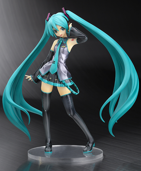
Character Figure
A painted mini sculpture of one of the OVA characters, similar to ones common for most anime. Which character would you most want to see given this treatment?

Personalized Character Pin-Up
An illustration of your OVA character as part of a custom-designed character sheet.

Lifetime Wise Turtle Subscription
Free access to all future Wise Turtle products. Includes PDF and print versions. FOREVAH.

So? What do you think?