Friday, September 27, 2013

Kickstarter Roundup 09-27-13


Where-in I pick through Kickstarter for the projects that most catch my fancy.


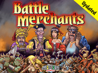
Battle Merchants

WHAT IT IS: A board game of weapon-selling economics set in a distant fantasy land. Where others see war and turmoil, you see profits, profits, profits!

WHY YOU SHOULD CARE: I love Euro games. I think the entire movement is bringing validity to tabletop gaming with its well-honed mechanics and involving gameplay. But let's be honest; a great deal of them have rather dry themes about this Pacific isle or that historical era—or some combination of the two. But Battle Merchants, with its colorful art and explicit fantasy themes of elves, dwarves, orcs, and hobgoblins, is a fun take on money-management.

WHAT YOU SHOULD GET: $48-58 Battle Master. This gets you a copy of the game at almost $10 off retail. But if you really like the art, there’s several pledges offering the artist’s original sketches that are pretty neat!

RELEVANT LINKS: @MinionGames | www.miniongames.com | Minion Games on Facebook

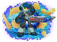
Mighty No. 9

WHAT IT IS: It's Mega Man by the creator of Mega Man with many of the developmental talents of past Mega Mans...but it's not Mega Man.

WHY YOU SHOULD CARE: With Capcom disappointing fans by repeatedly leaving poor Mega Man by the wayside in recent years, Mighty No. 9 is both an indulgent return-to-form and an excuse to revitalize the age-old Mega Man formula with some fresh ideas. Well, some fresh ideas...the fact that main characters Beck, Call, and Dr. White are about as dissimilar from Rock, Roll, and Dr. Light as a rock and a stone isn't lost on me.

WHAT YOU SHOULD GET: $60. Your name in the credits (and an OFFICIAL MIGHTY NUMBER), A copy of the game, its soundtrack, plus a retro-inspired physical gamebox and manual. Higher tiers include an artbook/strategy guide and various get your ______ in the game rewards, as well as dinner with the man Keiji Inafune.

RELEVANT LINKS: @MightyNo9 | Mighty No. 9 Facebook

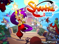
Shantae: Half-Genie Hero

WHAT IT IS: A new HD sequel to the well-loved Shantae series, featuring a brand-new style on top of classic bellydancing, hair-whipping action.

WHY YOU SHOULD CARE: Way Forward mostly does contract work for various companies and their licenses, but when they manage to save enough, the work they do for themselves tends to be pretty special. Mighty Switch Force, Sigma Star Saga, and of course Shantae prove an excellent pedigree for gaming. Now with Kickstarter, we won't have to wait another decade for a proper sequel.

WHAT YOU SHOULD GET: $75 STANDARD EDITION. Your name in the credits, a copy of the game, a physical version of the soundtrack, and various digital bonuses like an artbook and an extra transformation for Shantae. Higher levels include a hardcover artbook, your face/art in the game, invitation to a wrap-party, and a rather high-priced package including the original (very rare) Shantae for Gameboy Color.

RELEVANT LINKS:  @wayforward | www.wayforward.com

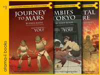
Atama-ii: Multiple Path Stories in Easy English

WHAT IT IS: A new take on the Choose-Your-Own-Adventure series as full-color illustrated eBooks.

WHY YOU SHOULD CARE: Because CYOA are awesome, especially for your favorite young-reader. And while the reading level of these books is very easy, the content is not trite or boring, with tales of trips to mars, life as an immortal across the milennia, or—yes—zombies…in Tokyo! With great illustrations and a writing staff partially culled from previous CYOA efforts, it looks like a great try at reviving this unique brand of storytelling.

WHAT YOU SHOULD GET:  $20…or do you choose another pledge level? Turn to page 12! Includes all 10 eBooks in iBook or Kindle format. Higher levels include signed prints, limited edition hardcover copies, cameos, or even the power to direct your own book in the series.

RELEVANT LINKS:  www.atama-ii.com

Wednesday, September 18, 2013

Kickstarter Roundup 09-18-13


Since I spend way too much time browsing Kickstarter anyway, I've decided to share a weekly (semi-weekly?) roundup of notable finds on the world's biggest crowdfunding site.


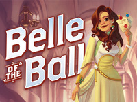
Belle of the Ball

WHAT IT IS: A card game where players become party hosts, each trying their best to put on the most talked-about get-together by carefully managing the guests they invite…or snub.

WHY YOU SHOULD CARE: With Daniel Solis as both Game Designer and Graphic Designer for the project, you know it’s a game that will play as good as it looks. He also designs all his games “in the open” on his blog, so it’s nice to support a designer who shares so much for free. (And I do mean so much, I swear Daniel tilts his head a little too far and game ideas come pouring out…possibly from his hair, though this is a mystery.)

WHAT YOU SHOULD GET: $25 House Party. The Belle of the Ball Kickstarter is light on exclusive extras, so there’s not a lot to choose from besides a copy of the game. Still, if you’re interested in reprints of some of Dice Hate Me’s (the publisher for the BotB) other offerings, there’s plenty of higher tiers that will oblige your interest.

RELEVANT LINKS: @DanielSolis | www.danielsolis.com, @DiceHatMe | www.dicehatemegames.com

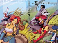
Calcula’s LVL UP!

WHAT IT IS: A collected volume of Fred Perry’s online Final Fantasy XI “doujin” comic, LVL UP!

WHY YOU SHOULD CARE: If you’re a fan of the artist’s previous works, like Gold Digger, then you probably don’t need any convincing. But LVL Up itself is a charming comic with a lot of heart, and any fan of Final Fantasy XI should get quite a few smiles out of it. Perry will not be publishing the book through normal distribution channels, so this will be your only chance to get your greedy Galka gloves on a print copy.

WHAT YOU SHOULD GET: $50 LVL THREE Support. The doujin signed and with a sketch of the eponymous Calcula on the dust jacket. Can you say no to Calcula? Can you?

RELEVANT LINKS: www.gd-tangent.com

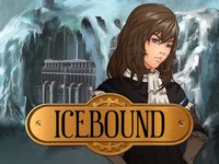
Icebound: A Visual Novel

WHAT IT IS: A visual novel set in a steampunk/dark-fantasy world in a frozen age.

WHY YOU SHOULD CARE: Visual novels can’t seem to get a fair shake in the American market, and Kickstarter hasn’t been much kinder (unless you count Megatokyo…). Somewhere between text adventure and novel, VNs imbue good stories with just enough visuals, music, and choices to make them fun to play. Icebound features beautiful backdrops, a nice premise, and a few mini-game bells and whistles to break up the walls of text that are the trademark of the genre. It’s as good an entry as any to what can be a really compelling medium for storytelling, and the more people aware of visual novels, the better.

WHAT YOU SHOULD GET: $25 Citizen. A copy of the game, the soundtrack, some wallpapers, and your name in the credits.

RELEVANT LINKS:  @vnwriter | www.fastermind.net

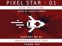
Pixel Star - 01

WHAT IT IS: A retro-inspired space-shooter with groovy 8-bit tunes and aesthetics

WHY YOU SHOULD CARE: While there’s nothing about the mechanics or aesthetics you probably haven’t seen before—especially if you have as much of a penchant for exploring such things on iOS as I do—the Jetpack Joyride meets Space Invaders: Infinity Gene 8-bit beat fest that is Pixel Star - 01 offers a competent-looking take on the casual retro game with a compelling design sense, all by a 16-year-old aspiring programmer.

WHAT YOU SHOULD GET:  $5 PC, Mac, iOS, or Android version. The pledge list is unfortunately a muddled collection of different packages, with each not being terribly clear of what it offers, but $5 gets you the game and supports a kid making his dreams come true.

Sunday, September 15, 2013

Kickstarting Kickstarter


Those of you who follow this blog (or my twitter account) are probably aware I recently ran a Kickstarter for my anime-inspired role-playing game, OVA. My experience with crowd-funding only bolsters my belief that we are on the verge of a real paradigm shift in how we create our content, interact with our supporters, and make things happen.

But Kickstarter isn't a magical push button for success. It’s a lot of work—I’m working on content to send to my backers as I write this—and for all the ways Kickstarter makes things easier, there are pitfalls that are just as easy to fall into. While I only have one project so far, I have been an active part of Kickstarters for Minion Games, Jolly Roger Games, Asmadi Games, and maybe a few other companies that end in "Games," and I’ve gotten to know my way around the most popular crowd-funding platform. It seems only fair to share some of the things I’ve learned along the way. Looking to start a project of your own? Read on, Macduff.

You may have read a few articles about Kickstarter to prepare yourself for the task ahead. Maybe you’ve read a lot of them. Apparently, you’re reading at least one—this one—and that’s good! The fact you’re not jumping into your first project believing it an autonomous money-making machine is certainly a proper first step. You may think the next one involves planning your pledge levels, writing your pitch, or setting up your marketing engine. But my first and most important piece of advice actually has nothing to do with your project at all.

BACK A PROJECT (OR THREE)

Before setting off on this adventure, it’s imperative that you actually try it out for yourself. While any project will do, finding a few somewhat similar to your own would be most ideal. You should back a project because no amount of research will teach you more about how Kickstarter works.

You understand your backers because you are a backer. You see firsthand what excites you in a project, what bores you, what annoys you. You understand what makes you want to pledge and at what levels. You get a feel for the kind and number of updates that neither feel too pushy or too sparse. You realize the questions you want answered by the project creators.

You understand Kickstarter because you see the process firsthand. You experience the ebb and flow of the campaign, the aftermath, the surveys, the private message system. You see inventive ways people modify the Kickstarter ecosystem with add-ons and stretch goals. You experience how Kickstarter notifies you throughout the campaign.

You instill confidence in your potential backers because you have been one of them. You show you believe in this whole crowd-funding thing, that you’re not just dropping in for an “easy” paycheck. People do care, and I’ve received several messages from people who greatly appreciated that I gave to a lot of other projects before I launched my own.

And come on, you get cool stuff. Why wouldn’t you?

PEOPLE JUDGE A BOOK BY ITS COVER

Despite the age-old axiom imploring you to do the opposite, people can and will judge your project by the face you put forward. It’s not only what catches (and hopefully holds) their attention, it’s an indication of what the finished product will be.

Now I know you’re launching a Kickstarter to make money, but you have to show that you’re making the effort, too. If you throw up a project that hasn't had a cent put into it, your campaign will look like a panhandle instead of your personal dream. Take the time. Save the money. Make sure you have a compelling and eye-catching thumbnail. Show at least one example of your final product, whether it's an interior spread, a fan of cards, or even just a selection of illustrations. Everything doesn't have to be polished, and don't feel you can't show prototype or in-progress items. But make sure your backers know exactly how great a product they will be getting when they back.

Your video is another matter of great importance. And by that I don’t mean you have to have a video. It helps, of course, but if your options are a great thumbnail and no video, or a video that is painful and annoying to sit through, you are much better off with no trailer at all.

I'm not saying you have to go blow your budget hiring James Cameron. While a really awesome video will certainly help, you can do just fine with less. The important thing is to never look careless. Don't upload a handheld selfie you took amid the din of the commuter car while heading to work. Don't ramble on for ten minutes about your project without direction or forethought. Make sure your product appears in the video, preferably upfront. If you aren't able to edit the video in a way to show off your art, assets, and components digitally, have a convincing prototype built and film it in lighting where it’s easily visible. If you have trouble speaking clearly or charismatically, consider hiring a voiceover.

REDUCE YOUR BARRIER TO ENTRY

People are busy, and they may be cramming their Kickstarter browsing in between all matters of multitasking. Don’t make it difficult to throw money at you. Limit the number of pledge levels as much as possible to eliminate backing confusion and paralysis. Detail what each of them include in the body of your project, with images if possible. Pitch the crux of what makes your project special early on in your video and on your page, not after a detailed history of your toils. If you can, offer a demo, quick-start, or print & play version of your game so potential backers can weigh first hand if the project is one they want to back.

There’s also one more barrier to entry to consider, and it’s an easy one to forget. “Why should I back now?” If you don’t give compelling answer to this, whether through exclusive content or cool bonuses, a lot of your fans will just buy your product when it’s available later...and after distributors, storefronts, and others have taken a substantial slice out of your profits.

DON'T SET YOUR GOAL TOO HIGH

Kickstarter is as much powered by psychology as it is by the content it purveys. The entire experience, from the personal appeal to help achieve dreams, to the limited window to support a project and receive its rewards, to even the Trivial Pursuit-esque backed project wheel, plays on human nature to maximize the desire to give money now instead of buying a given thing later.

With all that  working in your favor, you very much don’t want to shoot yourself in the foot by setting your goal too high. When you’re sitting on a campaign that’s half over and not anywhere close to its goal, it becomes an intense disincentive to backers. If it’s not going to fund anyway, why bother? Don’t underestimate how powerful this impression can be. I’ve seen time and time again great projects fail miserably because they set their goal too high, only to relaunch with a more modest target and make exponentially more money than their goal the first time!

So how high is too high? Projects differ so widely that what works for your five pound box of miniatures is not appropriate for your lightweight RPG. Just take a look at similar projects and see what seems to be a typical successful baseline. My personal rule of thumb is to cover your production and fulfillment costs, but leave out (at least a good portion of) your art and design budget. In other words, the stuff that hasn’t happened at the time of your Kickstarter. Of course, the minimum needs to be whatever you can afford to finish off the project, so this advice may not be appropriate. But as I mentioned earlier, you should try to cover some of your costs yourself, as a show of good faith and belief in your own project, if nothing else.

YOU CAN'T LET KICKSTARTER DO ALL THE WORK

Finally, just remember this is still your project, and you have to put in the time, too. Looking at OVA's stats, only 50% of the money pledged came directly from Kickstarter’s ecosystem. The rest was through my own efforts with social media, word of mouth, and the contacts I have built over time. But hey, that’s pretty empowering that Kickstarter can double your efforts, right? It’s a great time to make things, so go out there and do it!

Wednesday, May 8, 2013

OVA: The Anime Role-Playing Game Kickstarter is Live!

The day is finally here! After much tireless effort, OVA: The Anime Role-Playing Game's Kickstarter is live! You can check on its progress to the right, or click the link below to find out more.


I want to thank all of you who supported a little anime-inspired game I made 8 years ago. I hope you find the new version was worth the wait!

Monday, August 27, 2012

Somebody Set Up Us the Bomb

MINION MONDAY
 
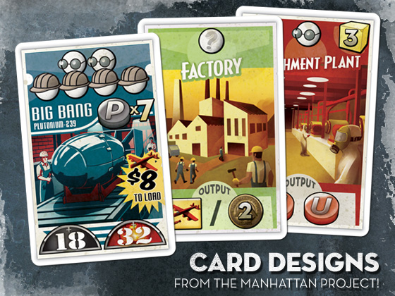
Of all the games I’ve worked on for Minion Games, The Manhattan Project was by far the largest undertaking. There were plenty of cards, boards, tokens, and funny little men to fashion for sure, but more than that, capturing the zeitgeist of World War II era propaganda and aesthetics was a deeply involving process. Instead of purely abstract spaces, The Manhattan Project is full of papers and posters, cards and envelopes, flyers and ephemera of a bygone day. Not only the design of these had to be right, but I wanted them to look old, like this box was a relic found stowed in the recesses of an attic.

CLICK TO BLOW UP
James Mathe, Minion Games whipcracker and all-around nice guy, was a stalwart ally in this cause. Throughout the process, he was always quick with an old 50s newspaper ad, vintage sales receipt, or a clever idea. Really, I can’t express enough it's worth your time to research materials in the theme you want to recreate! As much as you think you know a given look, there's nothing like a small period detail that can make a design sing.

The game’s main board was the bulk of the work. Since I wanted to convey a messy engineer’s desk, each element had to have its own design. I’m not fond of repurposing other’s stock images, so most everything had to be painted from scratch, from the weathered plastic frame of the cork board to the dingy ash tray that serves as the game’s “Bribe Pile.”

While the idea of a mess of papers was fun, I still wanted each piece to make logical sense. The spy track as film on a top secret file folder, the factories on an inventory receipt, and the university diploma all reinforce the idea of the what a given space you can place your hard-working workers is for.

For the cards, I wanted to reference the propaganda posters that are so defining of the time period. Bold but limited palettes, period fonts, and a good coat of wear and tear fleshed out the look. Instead of the standard white or black border, I placed the key elements on an actual poster shape, complete with tattered edges and a shadow to give that poorly pasted on effect.

FontBook, an iPad app I mentioned in a previous entry, was a great resource for font selection, with its ability to sort typefaces by the year they were created. Exploring these mid century fonts was a real joy.

The original Manhattan Project sold through its print run almost immediately on release, but fret not! Minion Games has launched a new Kickstarter. Not only can you get the original game, but a “Mega Expansion,” containing new bombs, buildings, nations, rockets, and famous people of the era, is up for grabs. You can even get this T-Shirt I designed exclusive to project backers!

Monday, July 30, 2012

Just in Case...


It’s no secret I’m really fond of Apple’s various iOS devices. Ever since I got the original iPod touch, it’s become an integral part of the way I work, consume, and interact with the bits and bytes I love.

Something I’m less fond of is Apple’s penchant for cladding its iPods in a stainless steel back. Oh, it’s beautiful for sure, but it’s a malicious and ephemeral sort of beauty, the kind of mirror finish that attracts scratches if you so much as look at it the wrong way. It’s a lesson I learned quickly with that first iPod touch, and one I rectified out-of-the-box when I replaced it with the fourth-generation model some years later. I chose the case from SwitchEasy because it advertised itself as the thinnest case on the market. Having been used to using my previous one naked for all these years, I really wanted the case to be as unobtrusive as possible.

It certainly was thin, and unobtrusive, but it was also a fragile thing, and after a year of use it began to fracture in the corners. I guess there’s a reason other cases weren’t this thin.

So long story short, I needed a new case, pronto. But I wanted it to last, so my preference for a barely-there case was no longer a top requirement. And if I’m wanting it to last...well! I better make it something I want to look at, right?

So that’s how this came to be:


Uncommon prints custom made-to-order cases based on whatever art you send them (like this great combined effort with Niko Geyer). The price may be a bit on the high side, but they take great strides to treat your order as a premium product. The case ships in a nice resealable bag, along with an Uncommon sticker and two $5 discount cards for future orders.

The case itself is definitely tough. It's a solid piece of plastic that won't flex under pressure and just feels solid in the hands. Maybe a little too solid. A thin case it’s not, and it takes the iPod touch’s almost impossible thinness and converts it to a heft more akin to the iPhone line of products. But we saw what thin got me, so I'll give it a pass in this regard.

This is the "capsule" case with a design that separates into two parts. This is ostensibly for easy docking in any matter of peripherals you might own that don't support the case, but doing so casually isn't really possible. Rubber-like strips on the inside of the case hold it firmly in place, making removing either portion a bit of a work out. At least you don’t have to worry about your case coming off accidentally!

Most importantly though the art looks great, with a few caveats. Lines aren't as sharp as they could be, with a ever-so-slight fuzziness to everything. This is almost certainly due to Uncommon’s much-advertised 3D-Tatt® technology. So while you may sacrifice a bit of clarity, the art is embedded deep into the plastic, making it impervious to flaking, surface scrapes, or other things you might normally expect from a printed surface. The art is there for the duration!

The colors are also off a bit, in general having a more yellow cast. Karis's hair also came out an almost bubblegum pink shade. But the colors are close enough that you probably won’t notice without a direct comparison.

That nitpicking aside, I’m really pleased with it. Having a customized case makes it really feel like your own, and I’m infinitely happier with it than a generic solid or pre-printed pattern.

An interesting aside is that the case is completely odorless. Most people probably don’t get what I’m saying here, but for those of you that are starkly aware of every new piece of electronics they buy, the Uncommon case is a pleasant surprise. I really expected a real painty-smell from the custom ink process, but really, there’s nothing. Even the flimsy SwitchEasy case (which was clear) had a stark plastic scent that lasted for a month — even transfers to your hands. It’s a small note, but a real exception to the rule in products like this.

As a final footnote, Uncommon's customer service is great. I was always able to get a live person on the phone, and they adeptly answered questions I had about bleed and such without having to play telephone relay with me. And when my first case shipped with the art between the halves not aligned, it only took a quick email to rectify the issue. I received a nigh-immediate response assuring me this was a rare error and a new one was shipped to me immediately. No returns. No additional shipping costs. Just a very pleasant experience.

I'd recommend Uncommon if you have an iOS device you want covered. In fact, remember those $5 discount cards I mentioned? I’m willing to give one away! Just leave a reply with the kind of case you want to make, and I'll send one lucky person the code. Feel free to pass along this post to anyone you think might be interested!

Tuesday, June 12, 2012

Get your Kicks on Route 6d6


Hey, everybody. If you can’t tell by the title graphic above, here’s another update on OVA’s eventual Kickstarter.

If you follow the forums on RPG.net, you may have come across a thread where I have been discussing the final pledge tiers. For those of you who don’t — or simply missed the exchange — I’m including it here:

$15. A copy of the PDF, as well as an advance look at the game before its public release.
$30. The above, and a copy of the full-color printed book.
$50. The above, and your name printed as a patron in the book. You will also have access to a special playtest forum with the opportunity to have your voice heard and help shape the final product.
$75. The above, except your full-color book is upgraded to one of one-hundred limited box sets, each numbered and including: A copy of the printed book, your name listed as a patron, Quick-Start Player Books, a pack of character sheets, a set of trading cards, and a set of dice.
$100 The above, and a special hand-crafted OVA Dice Bag by Dragon Chow Dice Bags.
$250 The above, and a custom character sheet featuring an illustration of your character by the official OVA artist. 

Since that thread, I’ve been researching the cost of the various pledge premiums, and I've found it’s very difficult to get a box produced in any quantity less than 500, and even then it’s almost as cost-effective to get 1000. I have found an option at Superior PoD with very reasonable rates for small numbers, but the box itself looks a little flimsy. Here, take a look.

The print quality looks great, and the build seems well put together with sharp corners. It’s something I wouldn’t bat an eye at if it were simply a container to hold a bunch of goodies. But my goal was to evoke the RPGs of yesteryear, and this isn't the thick cardboard heavy-duty box you may be used to. It's more like the boxes they use for "Collector's Edition" video games.

So what do you guys think? Would you still consider a box like this a decent collectable for high-pledge tiers? Or should I revise my pledge tiers and try something else entirely?